

Perfect & Proven ask ten designers or data engineers about the ideal number of rows in a table and you’ll get eleven answers. The truth? The “ideal number of rows in a table” depends on audience, device, density, and purpose. If you’ve wrestled with pagination, scrolling, or a cluttered grid, you’re in the right place. In 2025, we finally have practical heuristics, usability research, and performance patterns that make deciding easier.
This guide breaks down how many rows to show by default, how many rows to display at once on different devices, and what the maximum entries in a data table should be for readability. We’ll also demystify “excel maximum rows” vs. usable limits, and provide a repeatable framework you can apply to any product—dashboards, admin panels, ecommerce tables, or BI tools.
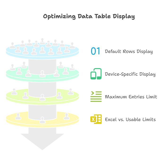
Quick takeaways you can use right now Perfect & Proven
- Most apps should default to 10–25 rows on desktop, 5–10 on mobile, and always offer a density switch and rows-per-page control.
- Choose how many rows to display at once using viewport height and row height, not guesswork.
- For scanning tasks (orders, tickets), 15–30 rows is comfortable. For analytical power users, 50+ with virtualization is fine.
- For readability, keep pages under 200–300 visible rows; beyond that, use filters, grouping, or infinite scroll with wayfinding.
- Respect user preference: persist a preferred default table row count across sessions.
Why the “ideal number of rows in a table” matters more than you think
Tables aren’t just UI—they’re workflows. Too few rows and users are forced into constant pagination; too many and scanning becomes a chore and performance tanks. In customer support, sales ops, finance, logistics—tables are where decisions happen. The right number of rows increases discoverability, lowers time-to-insight, and reduces bounce.
Consider three common modes of table use:
- Lookup: Find one item fast (e.g., “where’s order #8472?”).
- Scan and triage: Sort, scan, act (tickets, transactions).
- Analysis: Compare ranges and patterns (analytics, logs).
Each mode benefits from different row counts and density.
The math: a simple formula that just works
Use this to set your default, then test.
RowsVisible = floor((ViewportHeight − ChromeHeight − TableHeader − Footer) / RowHeight)
- ViewportHeight: browser window height (e.g., 900 px on many laptops).
- ChromeHeight: nav bars, toolbars, banners (often 120–180 px total).
- TableHeader: table title, filters, column headers (80–160 px).
- Footer: pagination controls (56–80 px).
- RowHeight: 40–56 px comfortable; 28–36 px dense; 64+ px spacious.
Example on a 900 px laptop:
- ChromeHeight 140, TableHeader 120, Footer 60, RowHeight 44
- RowsVisible ≈ floor((900 − 140 − 120 − 60) / 44) = floor(580 / 44) ≈ 13
Round to 12 or 15 for clean pagination options.
Preferred default table row count: UX benchmarks in 2025
Across design systems and SaaS products, these defaults show up again and again:
- Mobile: 5–10 rows (compact, large tap targets)
- Tablet: 8–15 rows
- Laptop (768–900 px height): 10–20 rows
- Desktop 1080p: 15–30 rows
- Ultrawide/4K: 25–50 rows (only if dense mode is on)
Why these ranges?
- Cognitive load: Users can comfortably scan 15–30 discrete items before attention drops.
- Fitts’ Law and eye travel: More rows increases scroll friction without good wayfinding.
- Performance: More DOM nodes degrade rendering on lower-end devices unless you virtualize.
Tip: Offer a “Rows per page” control with 10, 25, 50, 100 and remember the user’s choice as their preferred default table row count.
The table number of rows to display at once by context
Your “table number of rows to display at once” should reflect intent:
- Monitoring dashboards: 10–20 rows, auto-refresh, highlight changes
- Ecommerce orders/inventory: 25 rows default; 50 for power users
- CRM lead lists: 25 rows default; 10 on mobile
- Support tickets: 15–25 rows with strong filters and saved views
- Finance/ledger tables: 25–50 rows, sticky header, sticky total row
- Audit logs/error logs: 50–100 rows with virtualization and lazy loading
When in doubt, ask: Is the task scanning or analyzing? Scanning prefers 15–25; analyzing can push 50+ if the UI remains readable.
Maximum entries in a data table for readability
There’s no single magic number, but here are guardrails that hold up in testing:
- Per page: Keep visible rows under ~200 for general audiences; under ~100 for small fonts or dense data.
- For long sessions: Insert visual breaks every 50–100 rows (zebra striping, section headers, grouped rows).
- For infinite scroll: Show progress (e.g., “Showing 1–200 of 6,431”) and wayfinding (back-to-top, sticky filters).
- For export vs. on-screen: On-screen readability plateaus beyond 300 rows; for heavy analysis, offer CSV/Excel export or a pivot view.
Remember: readability is a function of column count, cell complexity (chips, tags, multi-line text), and line height—not rows alone.
Excel maximum rows vs. what’s actually usable
“Excel maximum rows” per worksheet sits at 1,048,576. Google Sheets caps on cells (up to 10 million). Those are technical ceilings, not usability guidelines. Usability tanks long before you hit those limits:
- Practical analysis max on a typical laptop: ~50k–100k rows with filters or pivot tables
- Practical on-screen scanning: 100–300 visible rows per view, with filters and grouping
- For millions of rows: Use databases, BI tools, or columnar engines; stream and aggregate instead of rendering everything
Key idea: store big, show small. Summaries, aggregations, and smart sampling beat rendering massive raw tables in the browser.
Row height, density, and scannability
Row height is the invisible lever that determines how many rows fit:
- Comfortable: 44–56 px rows; great for mixed audiences, wide columns, and text wrapping
- Dense: 28–36 px; best for power users and numeric data, requires strong line delineation
- Spacious: 60–72 px; great for touch, media, or when each row includes actions/avatars/tags
Pair density with:
- Zebra striping to reduce eye fatigue
- Sticky headers and toolbars
- Column freezing for first 1–2 key columns
- Clear column types (currency alignment, date format)
Pagination, infinite scroll, or “Load more”?
Each pattern controls perceived row count differently.
- Pagination
- Pros: Predictable; good for task resumption; clear location (page 1, 2, 3)
- Cons: More clicks; breaks continuous scanning
- Best for: Admin tools, reports, CRM tables
- Infinite scroll
- Pros: Frictionless; high content throughput
- Cons: Hard to bookmark/return; footer unreachable without care; performance pitfalls
- Best for: Feeds, logs with good filters
- Load more
- Pros: Hybrid control; preserves footer; reduces jank
- Cons: Manual effort; can confuse with changing totals
- Best for: Ecommerce listings, search results
Whichever you choose, show totals and context: “Showing 1–25 of 6,431 results.”
Columns matter more than you think
The exact same row count feels different with 5 columns vs. 14. Scannability drops when:
- Columns exceed viewport width (horizontal scroll without frozen keys)
- Cells wrap into multiple lines (height variance disrupts rhythm)
- Mixed content types (icons, chips) crowd text
If your table has >10 columns or frequent wrapping, lower the default row count by 20–30% or switch to a two-pane layout (table left, detail right).
Accessibility and assistive tech: make rows count
- Use semantic HTML: <table>, <thead>, <tbody>, <th scope=”col”>, <caption>
- Announce sort state: aria-sort on header cells
- Keyboard nav: Tab to header, Arrow keys within grid, focus rings
- Keep focus when paginating or loading more (don’t reset to page top silently)
- Provide a density toggle: compact mode is helpful for screen magnifier users too
A readable table for everyone usually means fewer rows, better spacing, and consistent interactions.
Performance: the quiet constraint on “how many rows”
- DOM nodes: Rendering 1,000+ rows x 12 columns = 12,000+ cells; this can stutter on mid-tier devices
- Virtualization: Render only what’s visible (plus buffer). Essential beyond ~200–300 rows
- Server-side pagination: Don’t ship 10k rows to the client if you’ll only show 25
- Suspense/Loading states: Use a shimmer loading gif or skeleton rows to keep perceived speed high
Rule of thumb: If you need more than 300 on-screen rows, virtualize and declutter.
A simple framework to decide your default row count
Think in four layers: Audience, Task, Device, Density (ATDD).
- Audience
- General: default 10–20 rows
- Power users/analysts: default 25–50 with compact density
- Task
- Lookup/triage: 15–25 rows
- Analysis/monitoring: 25–50 rows, virtualization if needed
- Device
- Mobile: 5–10 rows
- Laptop: 10–20 rows
- Desktop: 15–30 rows
- Density
- Comfortable: fewer rows; easier scanning
- Compact: more rows; add zebra striping and clear separators
Start with the smallest binding constraint. Then test.
Real-world story: when 10 became 25 (and then 50)
A product manager shared:
“I inherited a support dashboard set to 10 rows per page. Agents were paging constantly and missing SLAs. We A/B tested 10 vs. 25: handle time dropped 12% and satisfaction rose. Later we added ‘Compact’ density and a 50-row option for senior agents with bigger monitors. Performance stayed smooth after we added table virtualization. The kicker? Remembering each agent’s preferred default table row count cut friction to almost zero.”
Patterns by industry
- Ecommerce operations: 25 default, options 50/100, filters above the fold, sticky totals
- SaaS billing/revenue ops: 25 default, currency-aligned, group by month/plan
- Healthcare/EMR: 15 default (privacy spacing), strict column labels, dense option for clinicians
- Security/logs: 50–100 default with search-first, must have virtualization and copy-friendly cells
- Marketing campaigns: 10–20 default, card/table hybrid for rich media columns
Design details that boost readability without cutting rows
- Apply 8–12 px vertical cell padding (dense), 12–16 px (comfortable)
- Use left alignment for text, right for numbers, center sparingly
- Truncate with tooltip for long text; avoid multi-line in listing tables
- Color sparingly; rely on weight and whitespace
- Make the first column memorable (icon + label) and freeze it
Make “rows per page” a first-class control
- Place selector in the footer near pagination: “Rows per page: 10 25 50 100”
- Persist the user’s choice (localStorage or profile setting)
- Show totals: “1–25 of 2,314”
- Avoid exotic options; stick to familiar steps
Example (pseudocode):
JavaScriptconst key = 'rowsPerPage';
const defaultRows = 25;
const saved = parseInt(localStorage.getItem(key), 10);
const rowsPerPage = Number.isFinite(saved) ? saved : defaultRows;

// on change
function onRowsChange(value) {
  localStorage.setItem(key, value);
  renderTable({ rowsPerPage: value });
}
Testing your way to the ideal number of rows
- Success metrics: time-to-first-click, pagination clicks per task, error rate, scroll depth, CPU/paint time
- A/B test default row counts (e.g., 10 vs. 25) and density
- Segment by role and device; power users ≠ casual users
- Watch replays for scanning behavior; look for “back-and-forth” paging
Handling empty, partial, and very long tables
- Empty state: explain what should be here + primary action (e.g., “Create order”)
- Partial data: skeleton rows with shimmer; don’t jump layout
- Very long tables: add quick filters, saved views, and column search; show an “Up” button after 2–3 screens of scroll
Localization and variable row height
Longer strings in other languages expand cell width/height. Plan for:
- Slightly fewer visible rows in localized UIs
- Consistent row height by truncating and showing full text on hover/focus
- Resizable columns as an escape hatch for power users
Security and privacy considerations
- Mask sensitive columns (PII) by default; allow reveal with permission
- Avoid showing too many rows of sensitive data on shared screens
- Log exports/downloads and apply row-level permissions server-side
When not to use a table
If users mostly act on items one at a time or the content is highly visual, cards or list views may outperform tables. Provide toggleable views: Table for sorting/filtering, Cards for scanning visuals, and a split-pane detail view for deep work.
Ideal number of rows in a table for mobile vs. desktop
- Mobile
- 5–8 rows default
- Single action prominent; sticky header; no horizontal scroll
- Desktop
- 15–30 rows default
- More columns, frozen keys, compact density optional
If your mobile table uses large row content (avatars, tags, multi-line), drop to 4–6 rows for comfort.
Preferred default table row count by team role
- Executives: 10–15 (high-level summaries)
- Managers: 15–25 (triage and supervision)
- Analysts/Engineers: 25–50 (dense, with export)
- Support agents: 15–25 (fast scan, quick filters)
Let teams define org-wide defaults, then let users override.
Table number of rows to display at once—device-specific cheatsheet
- 720–800 px height laptops: 10–15 rows
- 900–1080 px desktops: 15–30 rows
- 1440p+ monitors: 25–50 rows (only if using compact density and virtualization)
- Tablet portrait: 8–12 rows
- Tablet landscape: 10–15 rows
Use your formula to dial this in for your product chrome and typography.
Maximum entries in a data table for readability—heuristics you can trust
- Keep a single view under 300 visible rows
- Group after 50–100 rows to aid wayfinding
- Prefer column filters over raw scrolling
- When users need “all,” give them export tools, not 10,000-row pages
Excel maximum rows—limits vs. good UX
- Excel maximum rows: 1,048,576 (technical limit)
- Good UX: show 25–50 on screen, summarize the rest, let users drill down
- Use pivot tables, slicers, and charts for patterns instead of raw rows
The same principle applies to web apps: store everything, display just enough.
Pros and cons: showing fewer vs. more rows
Fewer rows (10–15)
- Pros: clean, readable, fast; low cognitive load
- Cons: more paging; slower triage
More rows (25–50+)
- Pros: faster scanning; fewer page changes; great for power users
- Cons: potential visual clutter; performance concerns; higher cognitive load without good styling
Pick a default, then empower users to choose.
A practical checklist before you ship
- Rows-per-page control with 10, 25, 50, 100
- Density toggle (Comfortable, Compact)
- Persist user preference
- Sticky header + frozen key column
- Zebra striping in compact mode
- Virtualize beyond 300 visible rows
- Display totals and range (e.g., 51–75 of 6,431)
- Strong empty state and skeleton loading
- Keyboard navigation and aria-sort
FAQs
What is the ideal number of rows in a table for a dashboard?
For mixed audiences on desktop, 15–25 rows is a strong default. Dashboards are scanning-heavy, so keep the “table number of rows to display at once” modest, provide powerful filters, and show clear totals. Offer 50+ only with compact density and virtualization.
What should my preferred default table row count be for power users?
Start at 25. If your users are analysts or ops folks with larger monitors, add a compact mode and surface 50 or 100 as options. Persist their preference so they don’t have to change it every session.
How many rows are too many for readability?
Once you exceed 200–300 visible rows in one view, readability and wayfinding suffer. At that scale, use grouping, sticky headers, a back-to-top control, and strong filters. If users need the full set, offer export.
Does Excel’s maximum rows tell me how many to show on screen?
No. “Excel maximum rows” is a technical limit (1,048,576), not a usability guideline. On screen, most users scan best with 15–30 rows; power users can handle 50+ with compact mode and clear visual structure.
How many rows should I display at once on mobile?
Aim for 5–10. Reduce the number if rows contain rich content or multiple actions. Keep headers sticky, use larger tap targets, and minimize horizontal scrolling.
Should I use pagination or infinite scroll for long tables?
For worktables (admin, CRM, finance), pagination is usually better for task resumption and bookmarking. For feeds and logs, infinite scroll or “Load more” can reduce friction. Always show progress (“1–200 of 6,431”) and a back-to-top affordance.
Closing thoughts
The “ideal number of rows in a table” isn’t a single number—it’s a decision you tailor to task, audience, device, and density. Use the viewport-and-row-height formula to set a defensible default, offer simple choices like 10/25/50/100, and remember what users pick. Keep readability and performance front and center: fewer, clearer rows beat massive grids that nobody.
CLICK HERE FOR MORE BLOG POSTS
MOBI ROLLER is a tech enthusiast with a background in technology. He writes about the latest trends, tools, and innovations in the tech world, sharing insights based on both knowledge and experience.
I love how thoughtful and well articulated this is.
Outstanding writing, as always.