
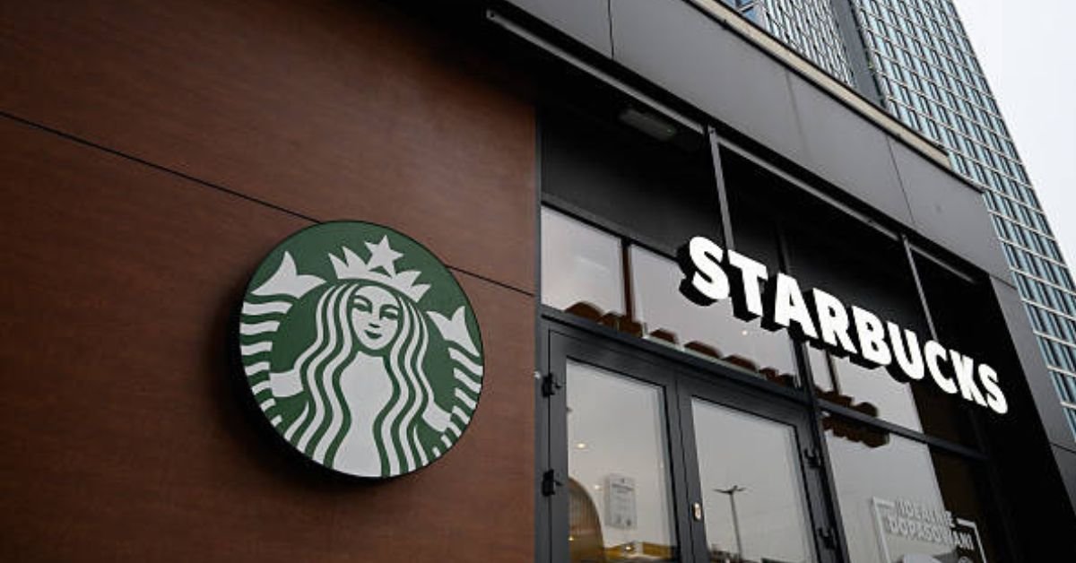
The Starbucks siren is one of the most recognized brand marks in the world — but her original 1971 form was raw, bold, and distinctly unlike the sleek green icon we encounter today. To understand the logo is to understand the entire philosophy of Starbucks: rooted in maritime mythology, brewed in Seattle, and refined across five decades into something that no longer needs a single word to be known.
The Birth of an Icon: The 1971 Starbucks Logo
The Founders’ Vision: Coffee, Tea, and Moby Dick
Starbucks was founded in 1971 by three academics: Gordon Bowker, Jerry Baldwin, and Zev Siegel. The three friends were passionate about premium coffee and opened their first store in Seattle’s Pike Place Market — not as a café, but as a roaster and retailer of whole-bean coffee, tea, and spices. The name “Starbucks” was itself a literary choice, inspired by Starbuck, the steadfast first mate of the Pequod in Herman Melville’s Moby Dick. The founders wanted a name that evoked the romance of the sea, the history of early coffee traders, and the spirit of the Pacific Northwest.
With a nautical name in hand, the founders turned to Seattle-based advertising agency owner Terry Heckler to create a visual identity. Heckler, rummaging through old maritime books and Nordic woodcuts, discovered something remarkable: an image of a two-tailed Norse siren — a mermaid whose seductive mythology made her the perfect symbol for a brand built on allure.
Terry Heckler’s Original Design: A Detailed Look
The Two-Tailed Mermaid (Siren)
The 1971 logo features a twin-tailed siren, drawn from a 15th-century Nordic woodcut. The figure is shown from the torso up, bare-breasted, with each hand holding one of her two fish tails splayed outward. Her long hair fans symmetrically on either side of her face. The pose is direct, even confrontational — deliberately so. The siren’s promise, in myth, is irresistible: she calls to sailors, offering something they cannot refuse. For a new coffee company, the metaphor was perfect. Starbucks wasn’t selling a commodity; it was offering an experience powerful enough to change how America understood coffee.
Key Visual Elements of the 1971 Logo
- Figure: Two-tailed siren (mermaid), bare-breasted, symmetrical pose
- Color palette: Brown and black — earthy, grounded, coffee-forward
- Wordmark: “STARBUCKS COFFEE, TEA AND SPICES” encircling the siren in a ring
- Typography: Bold, serifed capital letters in a circular arrangement
- Shape: Circular seal / medallion format
Typography and Color
The original mark was rendered in brown — a grounding, earthy tone that immediately communicated warmth, roasted beans, and old-world craft. The full wordmark read “Starbucks Coffee, Tea and Spices”, reflecting the store’s original product range. The text was arranged in a circular band around the siren, in the style of a wax seal or tradesman’s stamp, lending the logo an artisanal, pre-industrial authenticity that resonated with its Pike Place Market origins.
The Risqué Element and Public Reception
By modern standards — and even by 1970s standards — the figure was provocative. The bare-breasted siren raised a few eyebrows, but at the small scale at which the logo was printed on bags and signage, the detail was subtle enough to avoid outright controversy. Starbucks was a small, local specialty retailer; the logo was a mark of authenticity and craftsmanship, not mass-market branding. Its rawness was, in many ways, part of its charm. It would be nearly two decades before the nudity question would demand a more deliberate answer.
The siren was meant to evoke the same allure that the sea held for early traders — irresistible, mysterious, impossible to ignore. She wasn’t just a logo. She was a promise.— On Terry Heckler’s original design philosophy.

The Complete Logo Evolution (1971–Present)
Few logos have traveled as far as Starbucks’ siren — from a brown woodcut emblem in a Pike Place print shop to a wordless green icon recognized on every continent. Each redesign tells the story of a company outgrowing its own ambition.
1971
🪶
The Original
Brown. Bare. Bold. The two-tailed siren makes her debut in Seattle.
1987
🌿
The Green Shift
Howard Schultz merges Il Giornale with Starbucks. Green arrives. Hair covers the siren.
1992
🔍
The Crop
The navel disappears. The siren’s face moves front and center.
2011
⭐
The Icon
Wordmark removed. The siren stands alone — a true global icon.
1987
The Rebrand and the Green Siren
When Howard Schultz acquired Starbucks and merged it with his Italian-inspired café concept, Il Giornale, the visual identity needed to reflect the company’s new ambition. Terry Heckler returned to the logo and made two defining changes: the siren was covered — her hair now flowing across her chest — and the color palette shifted from brown to the deep green borrowed from Il Giornale’s identity. This green would become one of the most recognized brand colors in history, symbolizing growth, freshness, and prosperity. The wordmark was updated to simply read “Starbucks Coffee.”
1992
Cropping for a Close-Up
As Starbucks prepared for its IPO and continued rapid national expansion, the logo was refined again. The siren was cropped further — her navel, previously visible below the frame, was removed — and the circular mark tightened around her face and shoulders. The result was a more intimate, refined image, better suited for the scale of cups, bags, and storefronts.
2011
The Siren Stands Alone — and the Symmetry Problem
For Starbucks’ 40th anniversary, the company made the boldest move in its brand history: it removed the wordmark entirely. The siren no longer needed the word “Starbucks” — she was the brand. In preparing the new mark, the design team encountered a fascinating problem: a perfectly symmetrical face looked uncanny, almost robotic. The deliberate solution was to introduce a slight asymmetry to the siren’s features — one eye fractionally different from the other. This “designed imperfection” made her feel alive, human, and approachable. The logo that had started as a raw woodcut had become a study in refined craft.
The Meaning and Symbolism Behind the Starbucks Logo
More Than a Mermaid: The Siren’s Allure
In Greek and Norse mythology, the siren is a creature of dangerous magnetism — she calls to sailors from rocky shores, and those who hear her cannot resist. Her voice, her beauty, her promise of something extraordinary draws men off their course, toward her. It is, intentionally, a metaphor for coffee itself: the aroma that pulls you from the cold street into the warm café, the ritual that you return to not because you have to, but because you are drawn. The Starbucks siren doesn’t advertise coffee; she embodies the feeling of wanting it.
This is why the logo has survived virtually unchanged in concept for over 50 years. The figure, the mythology, the maritime heritage — these are not design choices that age. They are archetypal, which makes them timeless.
Decoding the Colors
The original brown of the 1971 logo was honest and grounded: the color of roasted beans, dark earth, and artisan craft. Brown communicated quality and tradition in a way that was appropriate for a small specialty retailer in 1971 Seattle.
The shift to green in 1987 carried entirely different connotations: it was the color of Italian café culture (via Il Giornale), of nature and sustainability, of growth and prosperity. Green also carries strong psychological associations with permission, freshness, and health — qualities that would become increasingly central to Starbucks’ brand identity as it expanded globally. The choice to keep green, and to deepen it into the now-iconic Starbucks Green, is one of the most consequential single color decisions in the history of retail branding.

Starbucks Logo: Design Specs & Brand Color Codes
For designers, brand professionals, and enthusiasts working with or studying the Starbucks visual identity, the following are the official color specifications and brand values associated with the Starbucks logo system.
Official Starbucks Green Color Codes
| Color Name | Swatch | HEX | RGB | CMYK |
|---|---|---|---|---|
| Starbucks Green | #00704A | 0, 112, 74 | 100, 0, 34, 56 | |
| Starbucks Dark Green | #1E3932 | 30, 57, 50 | 100, 0, 12, 78 | |
| House Green | #D4E9E2 | 212, 233, 226 | 9, 0, 3, 9 | |
| Original Brown (1971) | #6B3A2A | 107, 58, 42 | Approximate |
Typography and Brand Usage Notes
The modern Starbucks logo does not use a standard typeface — the wordmark on cup sleeves and marketing materials uses a custom modified font derived from a geometric sans-serif base, heavily tailored to the brand. The siren herself is a proprietary illustration asset, not a font character. For brand consistency, Starbucks enforces strict clear-space rules around the siren mark, requiring a minimum clearance equal to the height of the letter “S” in the wordmark on all sides. The siren should never be reproduced in colors other than the approved Starbucks Green or white/reversed applications.
Frequently Asked Questions
What did the original Starbucks logo in 1971 look like?+Why is the Starbucks logo a mermaid or siren?+Who designed the first Starbucks logo?+Why was the original Starbucks logo bare-breasted?+How many times has the Starbucks logo changed?+What is the color code for Starbucks green?+What does the Starbucks logo mean in Greek mythology?+Why did Starbucks remove the wordmark from their logo in 2011?+
Key Takeaways from the Starbucks Logo Journey
Mythology Is Timeless
Rooting a brand in archetypal stories — sirens, seafarers, the lure of the unknown — creates an identity that doesn’t age with trends.
Evolution, Not Revolution
Each redesign preserved the core siren figure. Starbucks changed what it needed to; it kept what mattered. That’s the discipline of a great brand.
Simplicity is Earned
The 2011 logo removed the wordmark not because it was simple, but because 40 years of consistency had made it unnecessary. Simplicity is the reward for strategic patience.
Imperfection Humanizes
The deliberate asymmetry added in 2011 shows that great design sometimes means choosing the flaw — because perfection can feel inhuman.
Brand design analysis for educational purposes. Starbucks® and the Siren logo are trademarks of Starbucks Corporation.
CLICK HERE FOR MORE BLOG POSTS
“In a world of instant takes and AI-generated noise, John Authers writes like a human. His words carry weight—not just from knowledge, but from care. Readers don’t come to him for headlines; they come for meaning. He doesn’t just explain what happened—he helps you understand why it matters. That’s what sets him apart.”