

Table of Contents
- Introduction
- Understanding Data Tables
- Best Practices for Data Table Design
- Responsive Design for Data Tables
- Accessibility Considerations
- Common Mistakes to Avoid
- Conclusion
Introduction
Data tables are essential elements in modern web applications, enabling users to interpret and manage large sets of information efficiently. Good data table design directly impacts how quickly and accurately users can source meaningful insights from complex data grids. Well-crafted tables are more than just functional; they contribute greatly to the flow and usability of an entire application. When planning data presentations, design choices can either strengthen user satisfaction or hinder it.
Whether you are designing a finance dashboard, an admin interface, or a report generator, recognizing how users interact with the information is critical. Effective tables facilitate easy scanning and comparison, which leads to better decisions and a smoother workflow. Incorporating proven design strategies ensures your tables are intuitive, accessible, and visually inviting. To browse inspiring examples and explore table UI patterns, you can find numerous contemporary designs analyzed for best practices.
Understanding Data Tables
Data tables structure content using rows and columns, allowing users to compare values and scan records quickly. This table format is prevalent in fields ranging from business analytics to healthcare platforms. With well-organized tables, tasks such as sorting, filtering, and editing become straightforward. Each column presents a unique attribute or variable, while each row represents a single record or item.
By clearly distinguishing between data types, like numbers, dates, and text, you provide context and prevent confusion. Properly formatted tables can accommodate everything from simple score lists to intricate databases. As digital products scale and serve a broader audience, optimizing tables for maximum efficiency remains a core design challenge.
Best Practices for Data Table Design
Several foundational design rules help create tables that are functional and user-friendly. One of the most basic is content alignment. Left-aligning text and right-aligning numbers enables quicker scanning, as users are familiar with these conventions from spreadsheets and printed materials. This method also supports quick visual comparison, which aids in error detection and analysis.
- Content Alignment: Text is usually more readable when left-aligned, while numbers are easier to compare when right-aligned. This straightforward approach reduces cognitive load and creates consistency across the table layout.
- Clear Contrast: Using alternating row colors (zebra striping) along with visually distinct header formatting creates a clear hierarchy and improves navigation. Well-defined contrasts help prevent users from losing track of rows, which can otherwise occur in information-dense tables.
- Appropriate Spacing: Adequate padding between cells and rows gives each element breathing room. Crowded tables make it hard for users to focus on key data points, which can lead to errors, especially in applications that display real-time data or require frequent updates.
Clear column titles, sticky headers for long tables, and fixed columns for essential data also reinforce usability without excessive clutter.
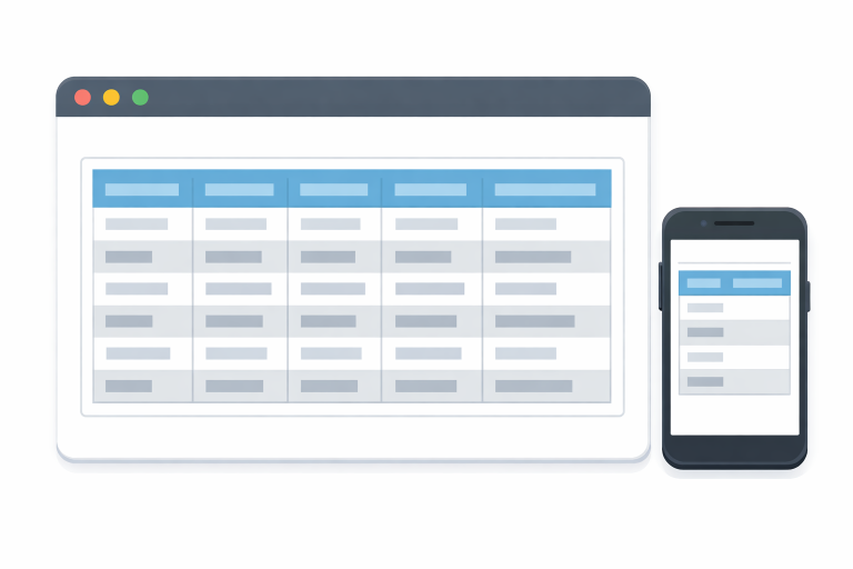
Responsive Design for Data Tables
Mobile devices account for a significant share of web traffic. Responsive design has become a must for data tables. With effective responsiveness, users can interact with your application comfortably on any device, whether they are reviewing reports on a phone or entering bulk data on a laptop.
- Prioritizing Important Columns: Not all columns are equally important. Consider hiding secondary columns or moving them into a collapsible menu on smaller screens. This solution prevents horizontal scrolling overload and keeps the main table concise.
- Horizontal Scrolling: If a table must display many columns, enable horizontal scrolling rather than shrinking text or truncating important fields.
- Collapsible Rows: Offer users the option to expand rows for additional details, maintaining a clean core display while preserving full information access.
For in-depth strategies, many resources outline mobile-first solutions for responsive table design, equipping UX teams to deliver similar experiences on all devices. One such resource is the guide provided by Smashing Magazine’s responsive table design article.
Accessibility Considerations
Accessible tables allow everyone, including people with disabilities, to interpret structured data effectively. Start by using semantic HTML properly. <table>, <th> headers, and descriptive <caption> titles, all of which provide crucial context for screen readers.
- Semantic HTML: Use header elements for columns and rows. Avoid using tables solely for layout, as this can confuse assistive technology.
- Alternative Text: For any non-text content in a table, include descriptive text for full context. This aids users navigating with audio tools or keyboard-only controls.
- Keyboard Navigation: Ensure users can tab through cells, jump across headers, and activate features without a mouse. Such enhancements directly improve usability for all.
The World Wide Web Consortium (W3C) provides additional guidelines for improving accessibility in its accessibility tutorial.
Common Mistakes to Avoid
Even well-intentioned designs can become difficult to use when certain pitfalls are overlooked. Overloading a table with too much information at once is a frequent error. This practice can overwhelm users and obscure crucial information. Focus on relevance by limiting what shows by default and enabling users to dig deeper with filters or expandable rows.
- Overloading with Data: Extensive tables are harder to scan, slowing decision-making. Simplify wherever possible by showing only the key columns, or allow users to choose which fields to display.
- Inconsistent Formatting: Variations in font size, color, or cell padding disrupt the reading flow and create distrust in the data’s reliability. Use a consistent visual system throughout your product for coherence and professionalism.
- Neglecting Mobile Users: Always validate your tables on real devices, not just in browser simulators. Missed edge cases in mobile sizing can prevent entire groups of users from accomplishing their goals.
Conclusion
Well-designed data tables are not only functional but also serve as critical tools in driving engagement, trust, and efficiency within digital products. An attention to detail, from content alignment and readability to responsiveness and accessibility, transforms ordinary tables into reliable user assets. By following these best practices, you’ll ensure that all users can interpret, navigate, and act upon your data with ease, regardless of their device or needs.
MOBI ROLLER is a tech enthusiast with a background in technology. He writes about the latest trends, tools, and innovations in the tech world, sharing insights based on both knowledge and experience.