
Butter yellow has quietly become one of the most influential colors in fashion, interior design, branding, and social media aesthetics.
Unlike bright lemon yellow or bold mustard tones, butter yellow offers something different. It’s warm without being overwhelming, cheerful without being loud, and sophisticated without feeling cold. That balance is exactly why designers, fashion houses, and homeowners are embracing it in 2026.
Whether you’re trying to understand the trend, decorate a room, refresh your wardrobe, or simply learn why butter yellow suddenly appears everywhere online, this guide covers everything you need to know.
What Is Butter Yellow?
Butter yellow is a soft, creamy shade of yellow inspired by the natural color of fresh butter.
It sits between pale yellow and warm cream, creating a subtle tone that feels inviting rather than attention-seeking.
Unlike neon yellows or golden yellows, butter yellow contains muted undertones that make it easy to pair with other colors.
Key Characteristics
- Soft and understated
- Warm and welcoming
- Light-reflective
- Versatile across styles
- Timeless rather than trendy
Think of it as the yellow equivalent of a beige that actually has personality.
Why Butter Yellow Is Trending in 2026
Several cultural and design shifts have contributed to butter yellow’s rise.
1. People Want Softer Spaces
After years of stark white interiors and cool gray palettes, consumers are moving toward colors that feel warmer and more human.
Butter yellow delivers exactly that.
2. Fashion Is Embracing Optimism
Major fashion collections increasingly feature soft pastels and comforting tones.
Butter yellow represents positivity without appearing childish.
3. Social Media Loves Light Colors
Platforms like Pinterest and Instagram consistently reward bright, airy aesthetics.
Butter yellow photographs beautifully under natural light.
4. It Works With Existing Decor
Unlike dramatic color trends, butter yellow integrates easily into most homes and wardrobes.
That practicality helps trends survive longer.
Butter Yellow Color Psychology
Color psychologists often associate soft yellows with:
| Emotional Association | Effect |
|---|---|
| Optimism | Creates positive feelings |
| Warmth | Makes spaces feel welcoming |
| Comfort | Reduces visual harshness |
| Creativity | Encourages fresh thinking |
| Energy | Provides gentle stimulation |
Because butter yellow is muted, it avoids the overstimulation sometimes associated with brighter yellows.
Best Colors That Go With Butter Yellow
One reason for its popularity is versatility.
Butter Yellow + White
Creates a fresh, clean aesthetic.
Perfect for:
- Kitchens
- Summer fashion
- Minimalist spaces
Butter Yellow + Sage Green
One of the most popular combinations in 2026.
Perfect for:
- Bedrooms
- Weddings
- Nature-inspired interiors
Offers strong contrast while remaining elegant.
Perfect for:
- Business branding
- Living rooms
- Smart casual fashion
Butter Yellow + Beige
Creates a luxury neutral palette.
Perfect for:
- Scandinavian interiors
- Quiet luxury fashion
- Modern homes
Butter Yellow + Dusty Pink
Soft and romantic.
Perfect for:
- Nurseries
- Wedding palettes
- Spring outfits
Butter Yellow in Fashion
Butter yellow has become a favorite among stylists because it flatters a wide range of skin tones.
Popular Butter Yellow Clothing Items
- Linen dresses
- Cardigans
- Blazers
- Wide-leg trousers
- Knitwear
- Summer shirts
Styling Tips
- Pair with white sneakers.
- Use gold jewelry for warmth.
- Combine with denim for casual looks.
- Add brown leather accessories for sophistication.
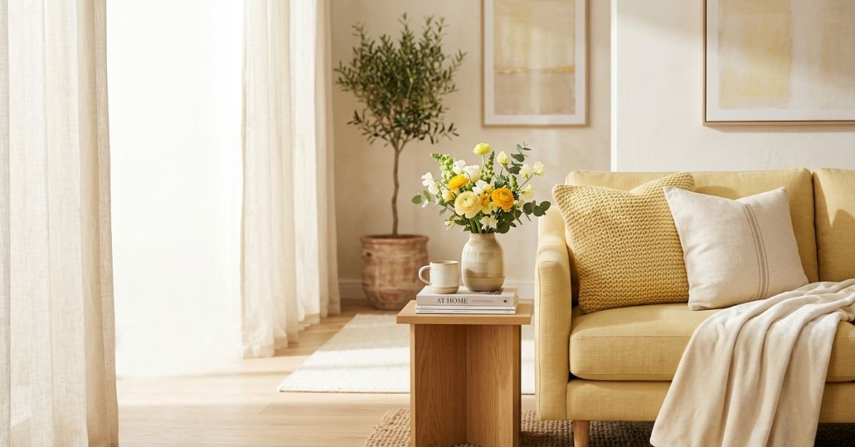
Butter Yellow in Interior Design
Interior designers increasingly recommend butter yellow as a replacement for traditional beige.
Living Room Ideas
- Accent chairs
- Throw pillows
- Area rugs
- Wall art
Bedroom Ideas
- Bedding
- Curtains
- Accent walls
- Upholstered headboards
Kitchen Ideas
- Cabinet fronts
- Backsplash accents
- Breakfast nooks
- Open shelving decor
Comparison Table: Butter Yellow vs Other Popular Yellows
| Color | Mood | Modern Appeal | Versatility |
| Butter Yellow | Soft & warm | Very High | Very High |
| Lemon Yellow | Bright & energetic | Medium | Medium |
| Mustard Yellow | Bold & earthy | High | Moderate |
| Golden Yellow | Rich & dramatic | Medium | Moderate |
| Neon Yellow | Intense & vibrant | Low | Low |
Butter yellow stands out because it combines warmth and flexibility better than most yellow shades.
Myth vs Fact
Myth:
Butter yellow only works in spring.
Fact:
It transitions beautifully through every season when paired with appropriate accent colors.
Myth:
Yellow makes rooms feel smaller.
Fact:
Lighter yellows often increase perceived brightness and openness.
Myth:
Butter yellow is difficult to style.
Fact:
It’s actually one of the easiest pastel colors to combine with neutrals.
Statistics Supporting the Trend
Recent trend analyses show continued growth in searches related to soft yellow aesthetics, pastel interiors, and warm neutral color palettes.
Notable Findings
- Pinterest trend reports have highlighted soft yellow palettes among emerging home design searches. [Source]
- Interior design publications report increased demand for warm neutrals replacing cool grays. [Source]
- Fashion trend forecasting agencies continue identifying butter yellow among leading seasonal colors. [Source]
Expert Perspective: What Designers Often Get Wrong
From years of observing interior and fashion trends, one mistake consistently appears.
People assume butter yellow should be treated as an accent color only.
In reality, its strength comes from acting as a foundational color. Large-scale applications such as walls, sofas, cabinetry, dresses, or coordinated outfits often create more sophisticated results than tiny decorative touches.
The most successful designs use butter yellow confidently rather than sparingly.
How to Use Butter Yellow Successfully
For Homeowners
Start with:
- Pillows
- Artwork
- Throws
- Lampshades
Then gradually expand into larger furniture pieces.
For Fashion Lovers
Begin with:
- Sweaters
- Shirts
- Accessories
Eventually incorporate dresses, suits, and outerwear.
For Brands
Butter yellow communicates:
- Friendliness
- Approachability
- Optimism
- Creativity
It works particularly well for lifestyle, wellness, food, and hospitality brands.
Frequently Asked Questions
What color exactly is butter yellow?
Butter yellow is a pale, creamy yellow with warm undertones. It is softer than lemon yellow and lighter than mustard yellow, making it versatile for fashion and interior design.
Is butter yellow still trendy in 2026?
Yes. Butter yellow continues to gain popularity across fashion, home decor, branding, and wedding design because of its warm and adaptable nature.
What colors match butter yellow best?
White, sage green, navy blue, beige, dusty pink, soft gray, and natural wood tones all pair exceptionally well with butter yellow.
Is butter yellow a warm or cool color?
Butter yellow is considered a warm color due to its creamy, golden undertones.
Can butter yellow work in modern homes?
Absolutely. It complements Scandinavian, Japandi, minimalist, contemporary, and modern farmhouse styles particularly well.
Does butter yellow work year-round?
Yes. While commonly associated with spring and summer, butter yellow can transition into autumn and winter when paired with deeper tones like navy, olive, or charcoal.
CONCLUSION
Few color trends achieve widespread adoption across fashion, interiors, branding, and digital design simultaneously.
Butter yellow has managed to do exactly that.
Its combination of warmth, optimism, versatility, and timeless appeal positions it as more than a temporary trend. As consumers continue moving toward softer, more comforting environments, butter yellow is likely to remain influential for years to come.
CLICK HERE FOR MORE BLOG POSTS
“In a world of instant takes and AI-generated noise, John Authers writes like a human. His words carry weight—not just from knowledge, but from care. Readers don’t come to him for headlines; they come for meaning. He doesn’t just explain what happened—he helps you understand why it matters. That’s what sets him apart.”